Creative Futures // Portfolio and Development

For Henry’s Creative Futures module, we are required to design posters, a business card and prepare our presentation boards for the degree show.

I first started with the business card.

I read an article called “Rules of an Effecting Business Card”

https://www.thebalancesmb.com/effective-business-card-2951735


1. Include only the most important information.

For myself, I only intend on having:

  • My Name
  • Career Speciality
  • Contact Email and Website
  • Instagram
  • LinkedIn

2. Make sure it’s legible.

Again, this one was taken into careful consideration, light blues and whites against dark should help.

3. Avoid full coverage.

Front and back I have used plenty of negative space.

4. Get them professionally printed.

I intend on going to vista print.

5. Design for your audience.

With the addition of themes within the CG/ Lighting department it should get my career choice across. E.g. A Light-bulb on the front side and a spotlit text-box on the back. Will become clear on the card itself.

6. Use special finishing options carefully.

For this i’m cosidering having the spotlit beam glossed over, that or have everything but the spotlight beam coated with a matte finish.


So going off these notes above, I began designing. Ideally after final year i’m hoping to pursue a career within the lighting/ cg department, so I began brainstorming on how I could get that across on my card. I knew I wanted to play with graphics and minimalist design.

I first thought maybe a wire framed light bulb would convey that I can 3D model and that i’m a lighting artist. And while it’s just a mockup design, I really don’t think it worked.
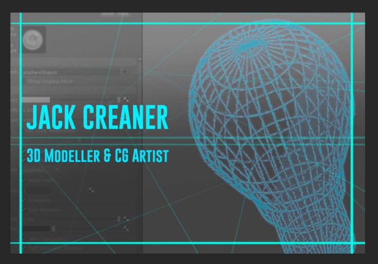
MockUp


The font however, I quite liked. After searching and having a read over the eBook “Meet your type – by fontshop San Francisco”, I carefully made the decision on what font I was going to choose.

After some searching, I found Gobold, which is a Sans Serif font. A Serif is a “slight projection finishing off a stroke of a letter in certain typefaces.” A Sans Serif font is a font that doesn’t feature any Serifs. I felt like this font was the perfect fit for my business card. Given that our eyes are naturally drawn to text first, a font that is bold and straight to the point was the perfect fit. And I think it does it’s job well.

SIDE A // FINAL DRAFT
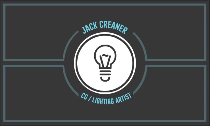
SideA


SIDE B // FINAL DRAFTS

SideB

SideB_V2.JPG

While i’m content with how Side A looks, I debated on Side B. I liked the simplicity of the spot lit circle, but featuring one of our lit environments might make it a bit more memorable when it comes to people who have seen our animation.

In the end I decided to go with the spot lit circle for Side B but just as a place holder. I think if I get a nice render closer to the end of the project I may substitute it in but as of right now I think the Side B I decided on ties the theme of the card together better.


Boards
Jakub and I talked about Board layouts and where everyone should be placed. From Left to Right we have Jakub, Phoebe, John and then myself. We felt this order was logical as it goes through the pipeline.

Jakub // Desiging and Modelling our Characters, along with Animation
Phoebe // Director, Storyboarder, Animatic and Animator
John // Environment Artist
Myself // VFX and Lighting

It runs through the pipeline. This way seeing as John and I worked quite closely together, we’ll possibly be able to show off some of our shared work together.

We also decided to have a life size cut out of our character. The pose isn’t final,
just a place holder for now.

boards


For my own personal layout, i’m wanting to have some of my lit environments and scene breakdowns on my screen. For example, and unlit scene with Light fade ins, and have VFX isolated from the environment. Possibly rundowns.  I’ll be filling out the rest of my board with assets i modelled and textured.

my boards.jpg


As for our final draft on the poster, Jakub and Phoebe (our creative directors) took charge there and this is one of our final drafts. (Not Final). We quite liked this one as it conveys a sci fi feel, a character possibly stepping out of their comfort zone, and does’t give away the plot of our animation but is enough to captivate attention.
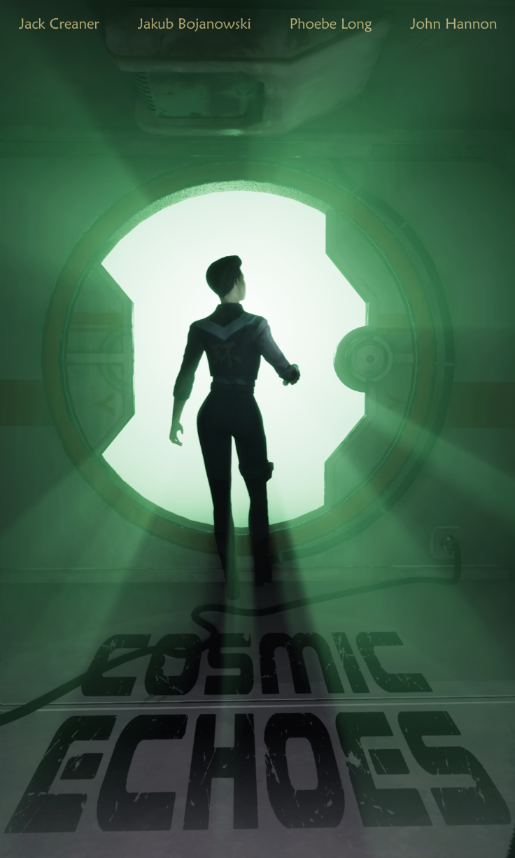
55557158_2011144682268021_5442247949474070528_n (1).png


Early on I did a brief mockup myself based on feedback on one of our earliest drafts. We were told to maybe think about the alien and blackhole element and play with that. Maybe create something a little more obscure and abstract.

Poster MockUP.jpg


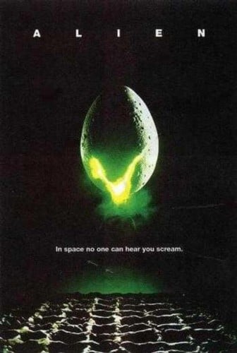
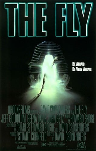
I read an article on cheatsheet.com on the “10 Greatest Horror Movie Taglines of All Time”, while looking for inspiration on what to add to the poster, and one that stood out was I Am Legend’s “The Last Man on Earth is Not Alone.”. I quite liked this one as something about it hit’s close to home when it comes to our animation. The Fly’s “Be Afraid, Be Very Afraid” and Alien’s “In Space, No One Can Here You Scream” really stood out to me also, although I don’t think there was any way of doing a variation on these without just ripping them off.

When it came to the actual design side of it, I read that you should make an impact. I decided to make the alien eye a main focus. As mentioned above, this theme inspires feelings of mystery and keeps it vague. But then it states that there is an alien presence and we’re trying to keep that hidden so the big reveal has much more impact. The articles i’ve been following also states that having one large graphic and making the poster as a whole easy to read also really goes a long way. (On that note, please ignore that I misspelt the word “Door”. (Dor?)

https://designshack.net/articles/inspiration/10-tips-for-perfect-poster-design/

https://www.cheatsheet.com/entertainment/theyre-here-10-greatest-horror-movie-taglines-of-all-time.html/

https://www.creativebloq.com/print-design/how-design-poster-pro-tips-7133634

Related imageSource: 20th Century Fox


Source: 20th Century Fox


Portfolio

Early Concepts

This slideshow requires JavaScript.


Lighting Tests in John’s Environment.

This slideshow requires JavaScript.


Props

This slideshow requires JavaScript.

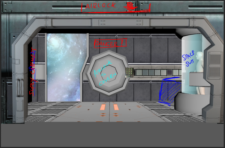
Airlock Concept

50745108_1185102028323783_4282548410948517888_n.png


Mashmob: Portfolio

Modelling: Chicken

Screen Shot 2017-02-23 at 13.26.48

Retopology: Chicken

Texturing: Chicken

Retopology: Dinosaur

Blend Shape Set-up: Dinosaur

Animations:

  • Dinosaur (Including Shatter Dynamics as it bites into the letter B)
  • Egg

Sound: All of the sound heard in the video. (See Animation Above)

Sci-Fi Scene: Portfolio

  • 3D Environment – Corridor, The Room, Everything within the room (excluding most items on the table as those models were borrowed from other people)
  • The Alien Body (before Jakub added Detail): The Body, the body suit, the teeth, tentacles.

Imported Models from the class:

Broken Tv Model: Cassie Galloway

Retro Computer Model: Michelle Beggs

Books/ Stationary: Samantha Quigley

Ray Gun: Phoebe Long

Science Apparatus/ Shelves: Johnny Rooney/ Philip McDowell


Sci Fi Scene: Personal Project

So Jakub and I teamed up for this project. We both had very similar ideas so we thought why not team up. The general idea of our scene is that there’s two separate parts. There’s the corridor and then the room. So the scene itself starts in the corridor. It’s very sci-fi spaceship hallway inspired. There’s a “survivor” at the end, crouched down hiding behind a crate. Just through the doorway is the room. It’s a lab/workspace type of room, but there’s a huge hole blown out of the wall so the room is exposed to Space outside. So everything in the room is floating. The narrative in the scene is that one of the survivors crew has hideously mutated into some messed up tentacle-y spider-like thing. (If you’ve ever seen John Carpenter’s The Thing 1982, that’s the general idea we’re going for.)

So the project began with ideation, references and inspirations. The two of us watched both versions of The Thing. The 1982 original and the 2011 prequel remake. Then we moved onto Alien 1979. We wanted to recreate the atmosphere of these two franchises in our scene.

Alien1

Alien2

Source of Screenshots:

Den of Geek. 2017. In praise of the sci-fi corridor | Den of Geek. [ONLINE] Available at: http://www.denofgeek.com/movies/313130/in_praise_of_the_scifi_corridor.html. [Accessed 9 May 2017].

Source: YouTube. 2017. The Thing [2011] Juliette’s Transformation – YouTube. [ONLINE] Available at: https://www.youtube.com/watch?v=MYepXJu031E. [Accessed 9 May 2017].

Concept Stage:

So once we had the general theme of the scene established, I got stuck into doing concept art for the Alien.


We eventually decided on doing the Spider like idea. So before getting stuck into the alien I started on the Corridor’s initial shape.


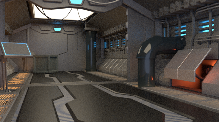
Once I had the corridor’s shape done I began adding the flooring, the wall panels and added some lights and texture to see how it would look. I decided the floor panels were way to small so I decided to remake them but bigger.


After I remade the floor, again I started experimenting with lights coming up through the vents and started adding things into the scene such as the pipes and door control panels. From here, I started adding the finer details such as the pipes and brackets on the walls.

The Final Corridor

Screen Shot 2017-05-01 at 23.48.42.png


The Alien:

Now that the Corridor was done and out of the way, I decided to get cracked into the Alien. So when I was starting the Alien, I first downloaded a pre-made Human Body model from TurboSquid.com.

Human Body Base Source: https://free3d.com/3d-model/male-base-88907.html

I started the Alien by first rigging the human body model. Seeing as I wanted it to be in the hanging position (because of the spider legs) I thought it would be best to rig it first. I used the Human IK tab. Once it was rigged I began posing it.


So this is the rigged character. Now that it’s posed I brought it into zBrush. To summarise my work flow, I usually start in maya for blocking out the model, and then start adding detail in zBrush. When the character was posed how I’d like it to be I brought it into zBrush and started raising parts of the back to make it look like it was split open. Once I was happy with how that looked I brought it back into Maya and started adding the teeth/ tentacles.


Now that the teeth and tentacles are in place I began adding the spider legs. I’ve left gaps in between them so that they can be reposed later should we need to repose it. And that’s everything I did on the Alien. I then sent it on to Jakub for it to be detailed.


The Room:

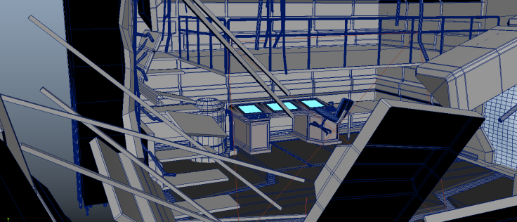
For the room, we knew we wanted there to be a massive hole in the wall, some sort of computer, an upper level (just to fill out the scene a bit) and clutter/ damage in general. So i got stuck into that. First I started with the shape of the room itself, and then started creating the hole and the foundation bars inside the wall. When i finished that I started putting the floor panels down and raised one of them to look like it was floating off into space. For the ship damage itself, I followed a digital tutors tutorial on how to make the scene’s damage look real and believable. The tutorial I follewed was “Digital-Tutors: Modelling Architectural Destruction in Maya.”


From here, I started adding stairs and railings into the scene and then started filling out the scene in general with models like the terminal computer,  the table and the planet outside for example.

All the items on the table bar the lightsaber (sneakily put that in there because it looked like it belonged in the scene) are models people from the class kindly donated.

Thank you Phoebe Long (Gun), Cassie Galloway (Broken TV), Johnny Rooney/Philip McDowell (Science apparatus), Samantha Quigley (Books/Stationary), Michelle Beggs (Retro Computer).

Room.png

Screen Shot 2017-05-12 at 19.20.59.pngScreen Shot 2017-05-05 at 19.16.37.png


FINAL RENDERS


Now that the project is done I can honestly say I’m happy with how it turned out! This is definitely my best work to date. If time would have allowed it I would have liked to texture and light it all properly but I’m planning on texturing it all over summer for my showreel. But yeah, i’m really happy with how it looks! Jakub and I worked well as a team and I hope to work with him again.

SHOWREEL


This one’s with final showreel, with the addition of the complete tv-sculpt, the re-rendered environment and the boat/wireframe models, i’m happy to call this complete.

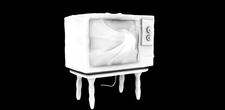
Tv Monster Sculpt – Completed

The sculpt is finally complete, and I can happily say i’m pretty proud of it! The following model is the high poly version.

High Poly


Low Poly version; for Animation.

Screen Shot 2017-01-09 at 03.18.17.png

So obviously I chose to take on the digital sculpt assignment. It was strongly recommended that we sculpt our monster in using zBrush, so that was my program of choice. The user interface was pretty scary to begin with but the more I used the program the easier it got, although I still have so much to learn.

I love how the final sculpt turned out and as I said above, with it being my first proper sculpt I am quite pleased with it! However, when it came to breaking it down and retopologizing it so it would be suitable for animation, I lost so much detail. I attempted to retopologize by hand but I just couldn’t for the life of me work out how to create proper edge flow when it came to the veins coming from the screen. Seeing as they were spreading out in different directions across the surface I had no clue. I decided to use the Remesh option under the subtools to bring the polycount down, then zRemesh’d it. The topology was awful at first, but by using the zRemesher guideline tool I easily fixed this problem.

Portfolio: Tree Shrine

PORTFOLIO:

I’m going to use this Portfolio post to do a run through of all the models I contributed to the project starting with the dome and corridor.

The Dome and Sci-fi Corridor

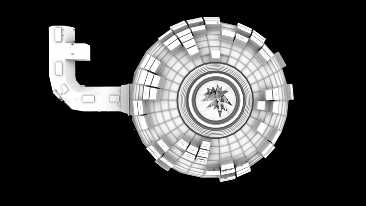
So i was responsible for putting the dome together. I made up the dome through using a sphere and making simple extrusions throughout to make it look like it’s made up of panels. Seeing as we wanted our scene to look abandoned and in a state of decay, I decided to leave some holes. These can be filled in later with broken panels and machinery. We also knew that we wanted a huge crack in the ceiling to allow light to pour in.

screen-shot-2016-11-03-at-23-06-01
The Dome (Top View)

corridor_dome

Just outside the Dome’s entrance is The Corridor. Cassie was working away on this. While her model was looking well, it was made in an awkward way that would result in it being problematic later. So i offered to remake the tunnel for her. Once I did i passed it back to her for her to import all the insides such as the pipes and screens etc.

Just to clarify: The only thing in the corridor that I made was the corridor shape itself, and the gratings in the floor and the door/keypad. I’ll talk about those later. All the rest belong to Cassie and Dervla.

corridorshape

corridorone
The Corridor

Gratings

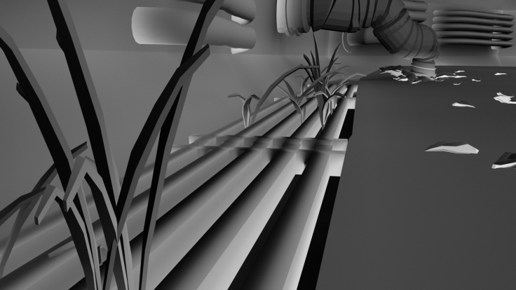
To make these gratings, I created a cube, stretched it. Cut away the holes and used the “append to polygon” tool to patch it up. These were then duplicated throughout the scene.

The image below shows the gratings in the scene.

Note: The grass does not belong to me, they’re Dervla’s models.

gratings

The Door & Keypad

The images below show the door that separates the two scenes. (The Corridor and The Dome). I started making the door after we had the corridor constructed so I had a theme to follow.

keypaddoortvhallway

After looking through quite a few different sci-fi themes (Alien Isolation, Portal 2, Dead Space to name a few) I ended up finding that they mostly followed the same design. Everythings very hexagonal/octogonal. Well not really but nothing’s really square if that makes sense. They all have those sort of, hexagonal based corridors. (If you haven’t guessed i’m really struggling to explain this point.)

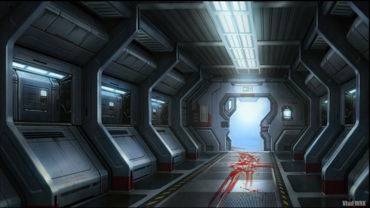
I based the shape of the corridor and the door itself on this image I found.

Screen Shot 2016-11-05 at 15.59.40.png

DeviantArt. 2016. Sci-fi corridor by VladMRK on DeviantArt. [ONLINE] Available at:http://vladmrk.deviantart.com/art/Sci-fi-corridor-451099912. [Accessed 04 November 2016].

It’s by an artist on deviant art. Vlad MRK.

Inside the Dome:

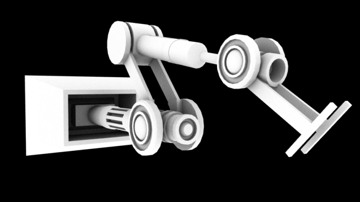
The Panels & Mechanical Arms

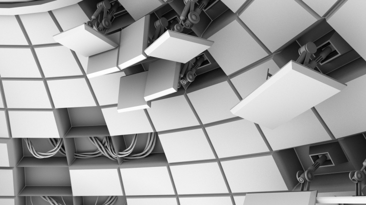
So back to what I briefly mentioned earlier, the Panels. The panels themselves are supposed to take up the entirety of the dome, but seeing as the scene is in a decaying state I left holes that can be filled in. To explain it better, every one of the panels in the wall are actually mechanical arms based on industrial line arm robots. Kind’a like in portal, these panels can rearrange themselves if they are required to. And again, our scene is dead so so is all the machinery. I inserted these in a way that it looks like they’re hanging out of the wall. (Some parts of the wall panels have detached and are just hanging there motionless.)

As always just to clarify: I own everything in the following two images apart from the wires seen in the bottom right corner of the first image. Those cables are Cassies.

panelsmechanical_arm

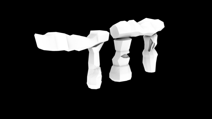
The Stone Henge like gate ways… uh… things…

We never actually ever agreed on a name for these things. We just called them gates. Seeing as the Shrine itself was going to be the main piece, we wanted it to be surrounded with some sort of mini shrine or gateways to show the importance of it. We ended up settling on having mini shrines beside it. We ended up basing them off of stone henge’s design. That kind of stacked rock look.

Here they are. Because of the size of the scene we didn’t want to over do it with models so we only used the one-legged one.

gates

stackedrock
The Gateway leaning on the Shrine’s rock

The Generator/ Panel Dome

In ideation phases, Dervla showed us a concept sketch she did showing the Shrine and Tree. Behind it was a huge panel that resembled Japan’s rising sun. It would fit in thematically so we went for it. I ended up building this huge generator with the rising sun flag in mind.

generatoroverview

screen-shot-2016-11-05-at-16-16-02. File:War flag of the Imperial Japanese Army.svg – Wikimedia Commons. 2016. File:War flag of the Imperial Japanese Army.svg – Wikimedia Commons. [ONLINE] Available at:https://commons.wikimedia.org/wiki/File:War_flag_of_the_Imperial_Japanese_Army.svg. [Accessed 04 November 2016].

Create a free website or blog at WordPress.com.

Up ↑